Meetup
Growing subscriptions
Background
Meetup has been a company for over 20 years with subscriptions being a cornerstone to its business. It's been imperative to continuously improve the design and functionality to optimize for the best conversion. So many different tactics were attempted over the years, from making the process simpler, separating each step on its own page, getting rid of some steps altogether, and refining the content.
Challenge
How might we improve the existing subscription flow to help increase the conversion rate for both web and apps? How might we better optimize for the platform that the flow is shown on?
Role
Lead product and visual design
Timeline
Six months from conception, iteration to launch
Platform
Responsive web and mobile apps
The Approach
Competitive analysis
Looking into competitors, it wasn’t as clear what we should do, especially on the web. The subscription flow on the web was relatively modern and separated each part of the process into simple steps.
The apps design was an entirely different story; the entire subscription flow was on a single screen. From everything I saw competitively, this did not align with current patterns. It also didn’t seem easy to complete from a user perspective.
Collaboration & experimentation
After meeting with the stakeholders for this project, we agreed to experiment and continually iterate on the product as we got results. We explored different strategies, eventually choosing the one that gave the best resulting metrics, which turned out to be showing each step on its own screen for both apps and web.
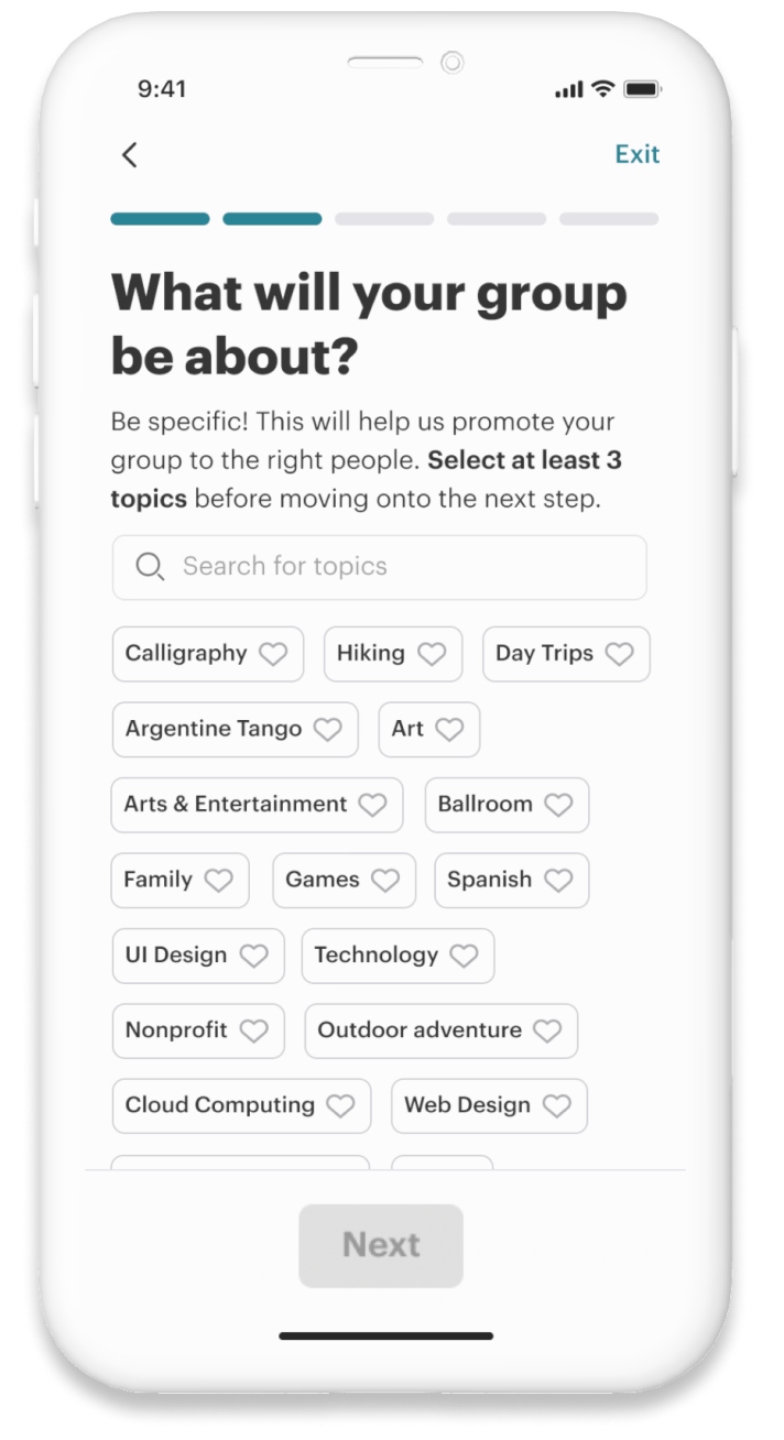
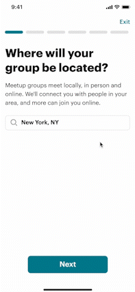
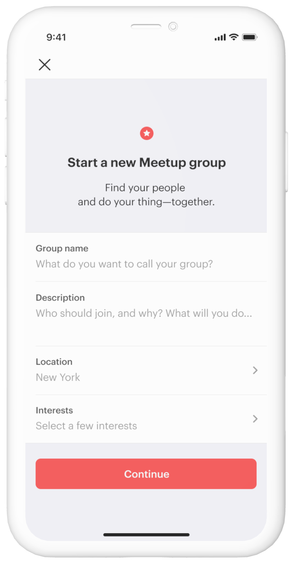
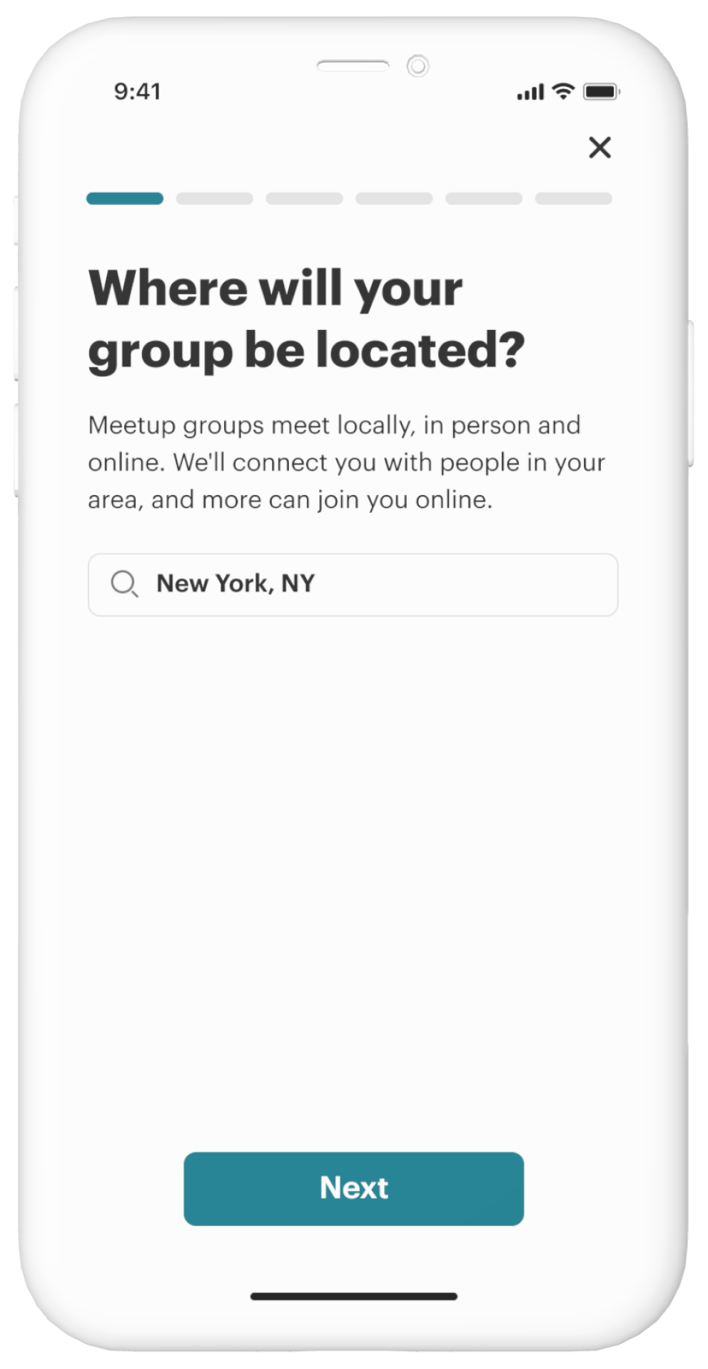
The Solution on Apps
Each step optimized specifically for mobile
Each step included a question, context for what the screen was for, and an input field that was visible even if the keyboard was active.
Design modernization
Taking inspiration from other apps, the overall design was intended to feel more minimalist and simpler to go through, despite it being more steps.
BEFORE
AFTER
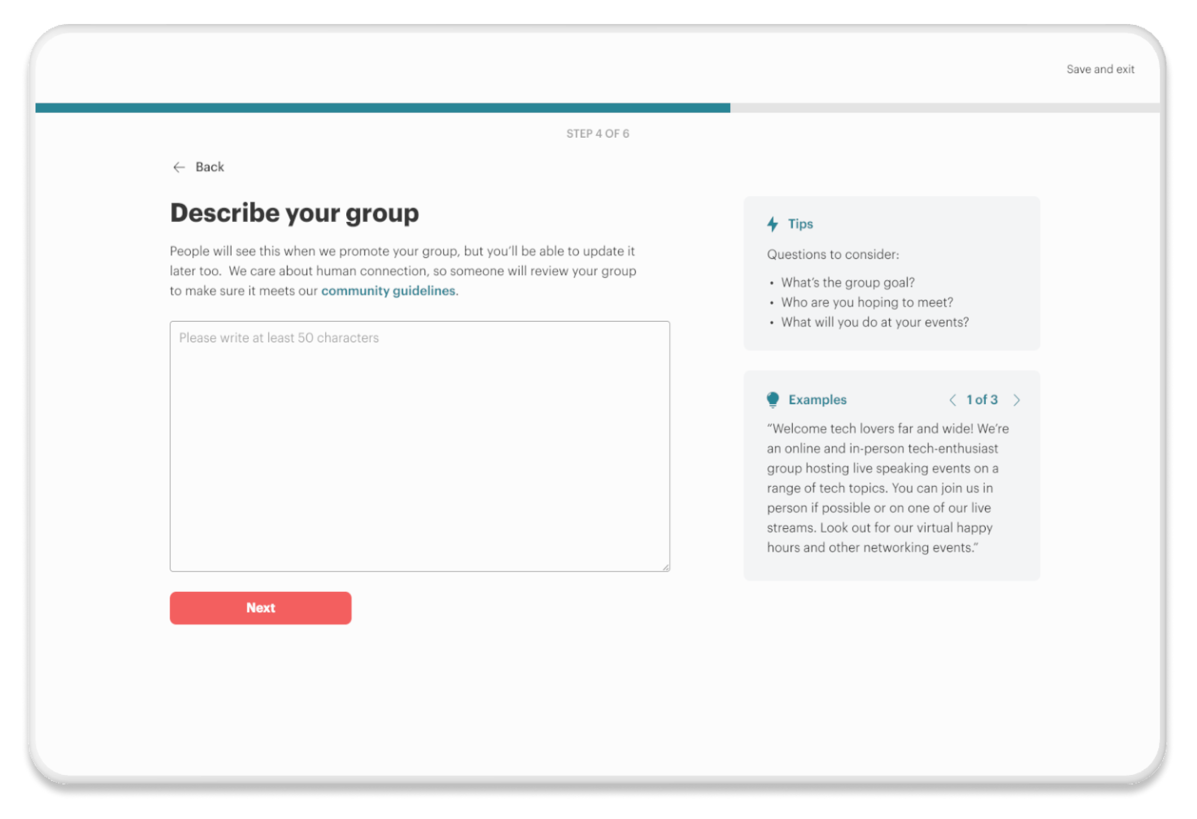
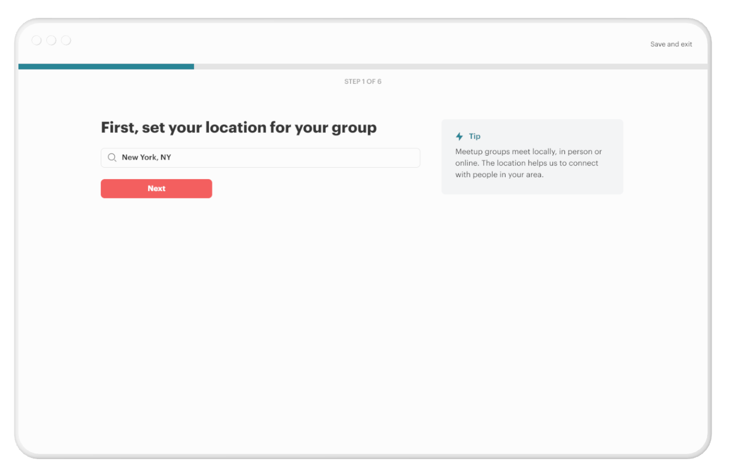
The Solution on Web
Optimizing for mobile web
Similar to the apps redesign, we included context for each step, while making sure the input fields were visible even if the keyboard was active.
Keeping important information on desktop scannable
Moving the tips and some context to the right side of the screen and aligning the steps to the left, helped to encourage scannability.