USA TODAY
Elections 2016
Background
Presidential elections is one of the most pivotal times for any news organization. Happening once every four years, it is well anticipated but advancements in web capabilities make it a new and different challenge every time. With the political climate of 2016 being as contentious as it was, it only upped the ante even more.
Challenge
How do you balance the conventions of the past elections along with the innovative new web? Many elections websites look very similar. Elections are often red and blue with hints of yellow or green, but what really sets one website apart from the other is the way it functions. Crafting this experience is pivotal to making a successful elections experience.
Role
Lead user experience architect I from the inception of the elections outlook experience to the night of general election results.
The Approach
Interviews, competitive analysis, sketches & wireframes
Knowing that this experience was going to be a multi-month complex two-part project, I created a user experience strategy that would match the depth necessary to create a premier elections experience. In the initial phase, I created questions for user interviews, completed an extensive competitive analysis, and collected analytics for past experiences that culminated in multiple presentations for stakeholders.
Site map
After meeting with the stakeholders for this project, we agreed to experiment and continually iterate on the product as we got results. We explored different strategies, eventually choosing the one that gave the best resulting metrics, which turned out to be showing each step on its own screen for both apps and web.
Sketches
I brainstormed and created sketches by synthesizing the information I gathered from data analytics, competitive analysis, and user interviews. This resulted in a series of modular components that would enable stakeholders to stack and rearrange them as desired based on priorities that still needed to be determined.
Wireframes
Once a direction had been set, I created a series of low-fidelity wireframes and a wireflow to show how a user would go through the experience. Since the website was released in two phases with the outlook experience launching first, the structure of the site (i.e., navigation and layout) needed to scale in order to accommodate both sites. In addition, the wireframes needed to incorporate the users’ and editorial needs. Editorial, who was programming all of the content and stories, was a major stakeholder for this project.
Final steps
Taking the wireframes and turning them into an InVision prototype, I wrote and facilitated user tests to see how the new design resonated with USA TODAY’s users.
Repeating the process
Once the outlook section was in development, I went directly into wireframing the general elections night experience. Since much of the design work and the placement of modules were completed within the outlook phase, I was able to focus primarily on the navigation changes and edge cases.
The Solution
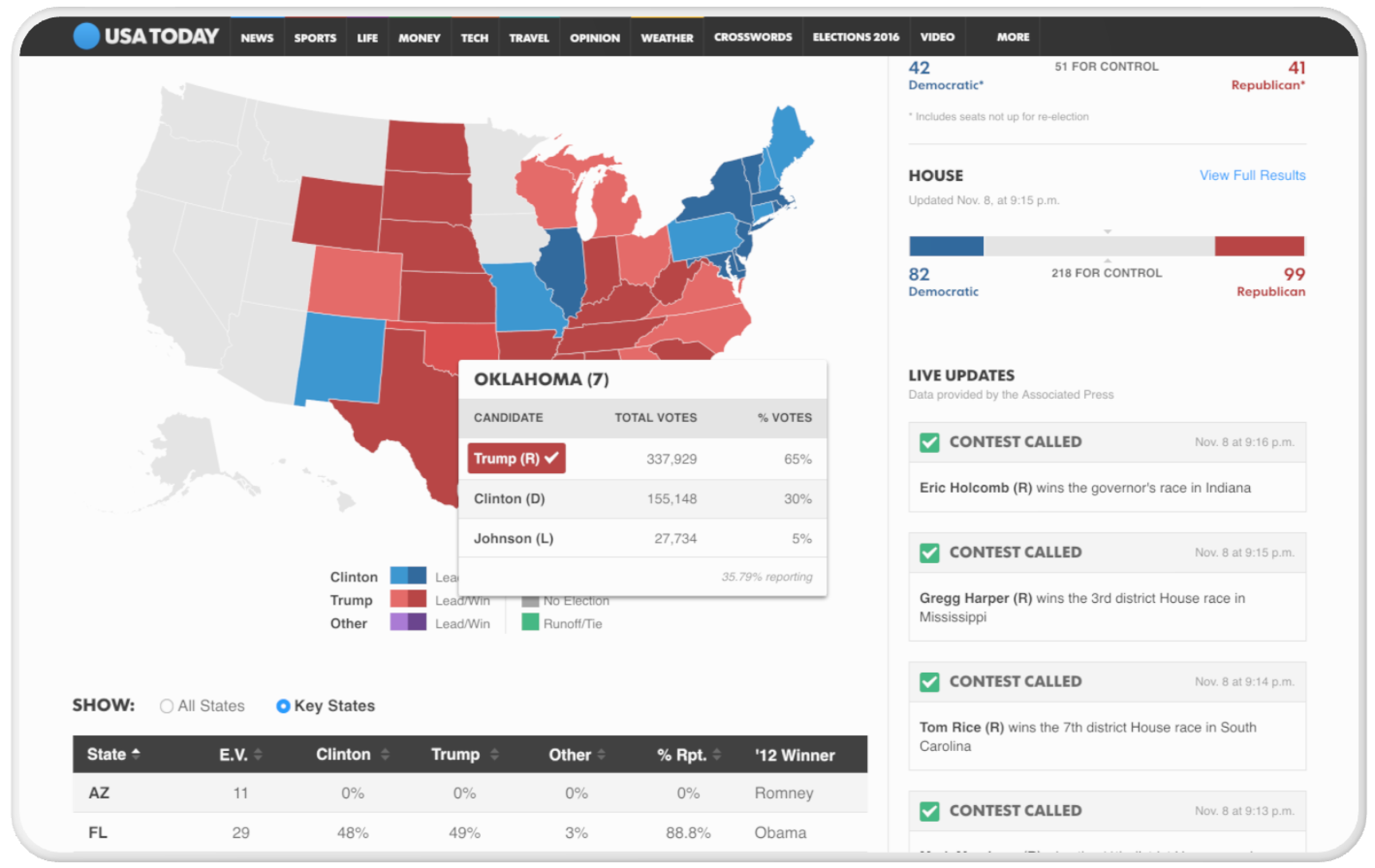
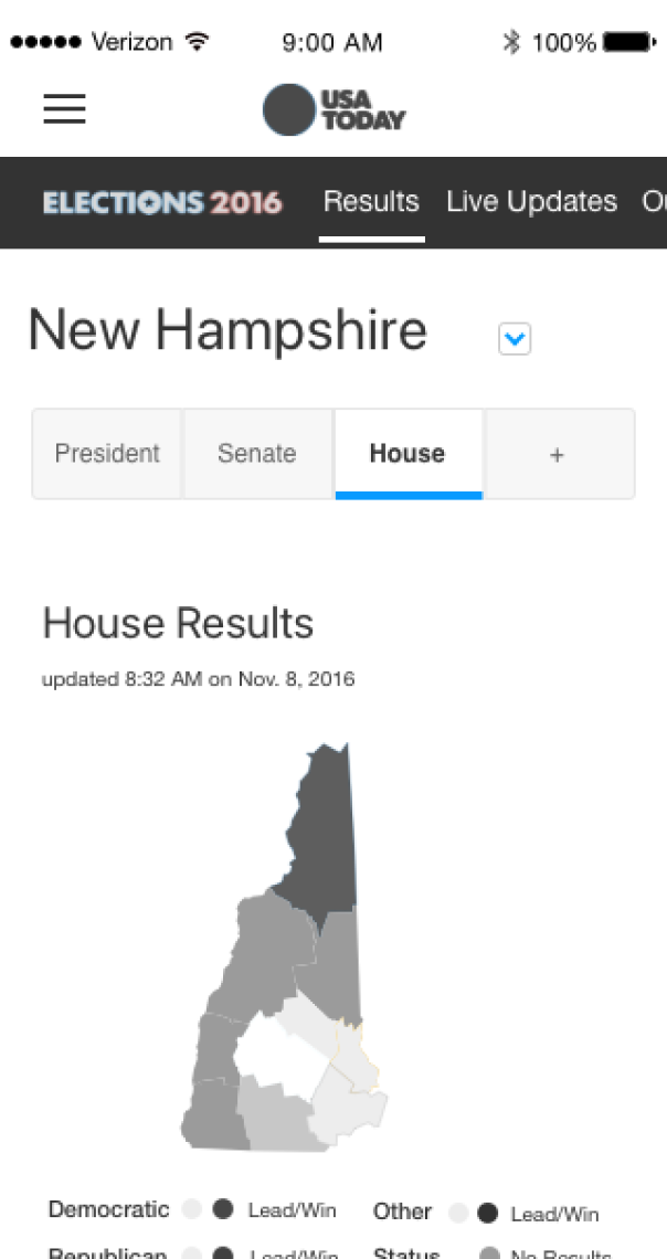
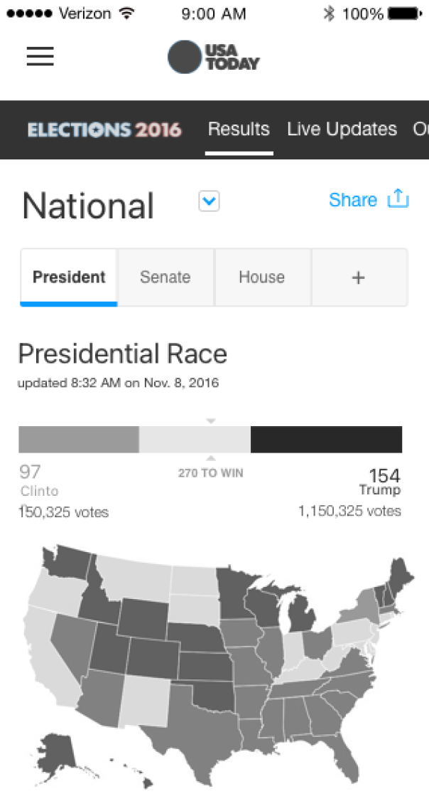
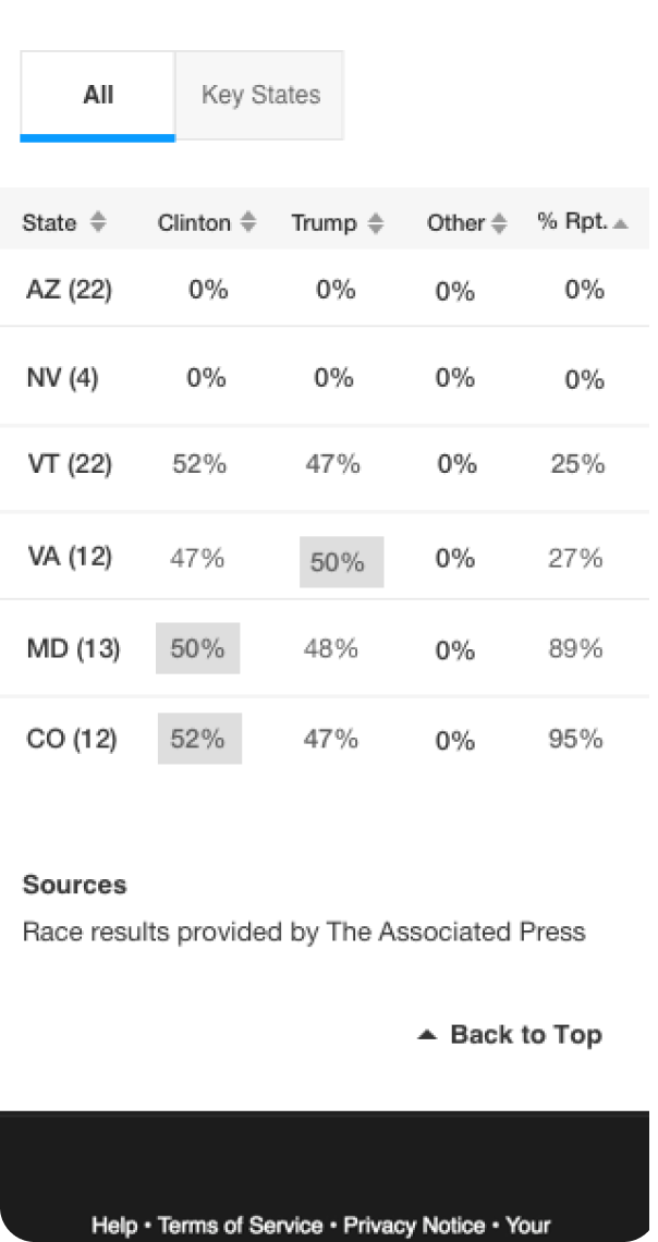
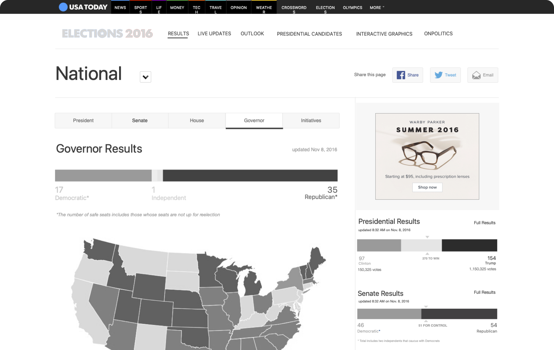
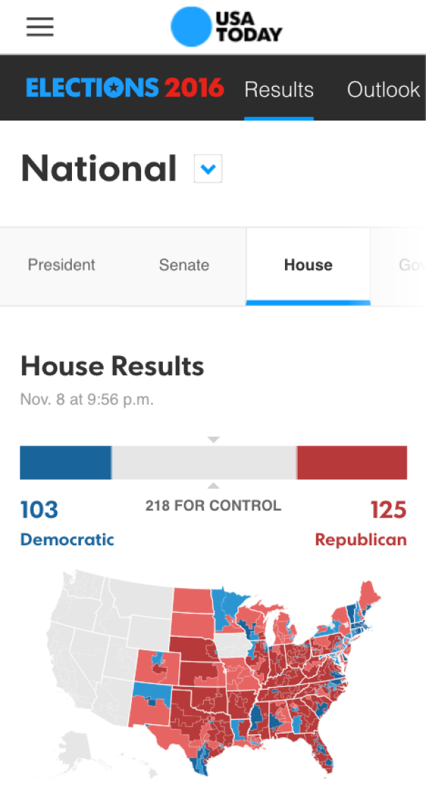
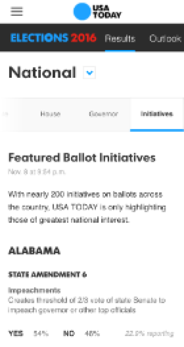
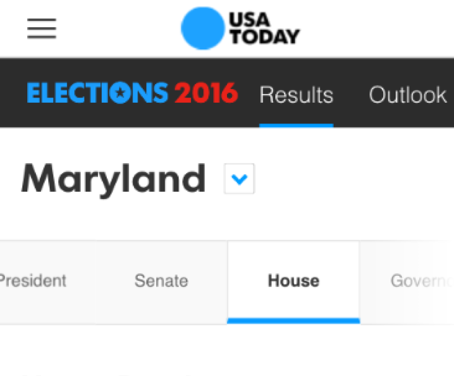
Mobile first experience
All of modules, including the large election results data sets were created to look like they were meant for mobile viewing (and to look great on desktop too).
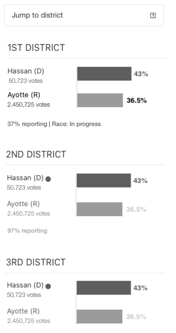
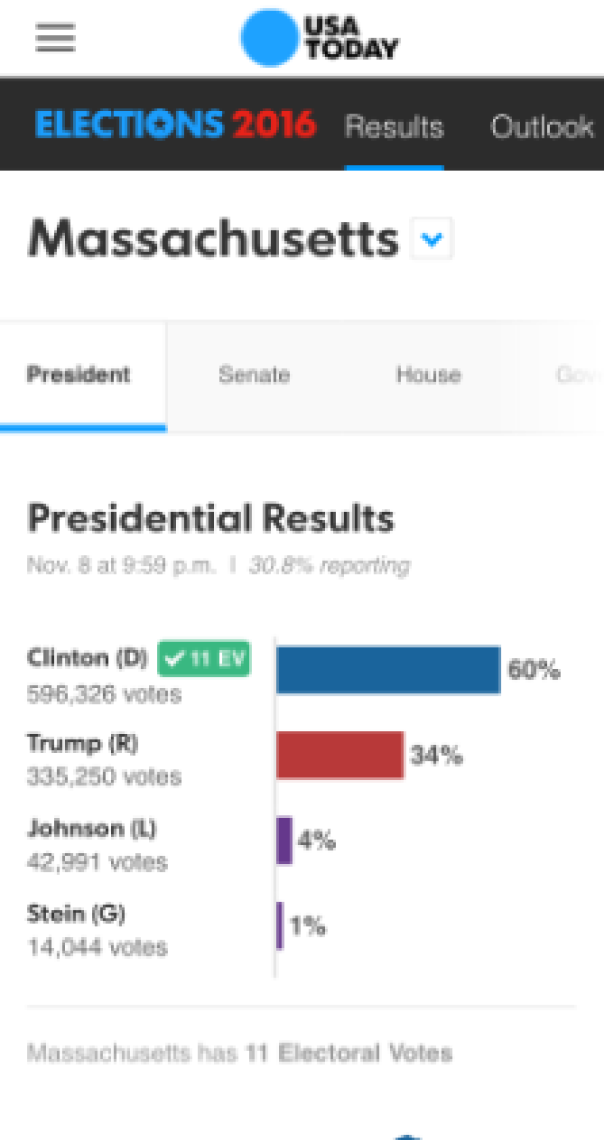
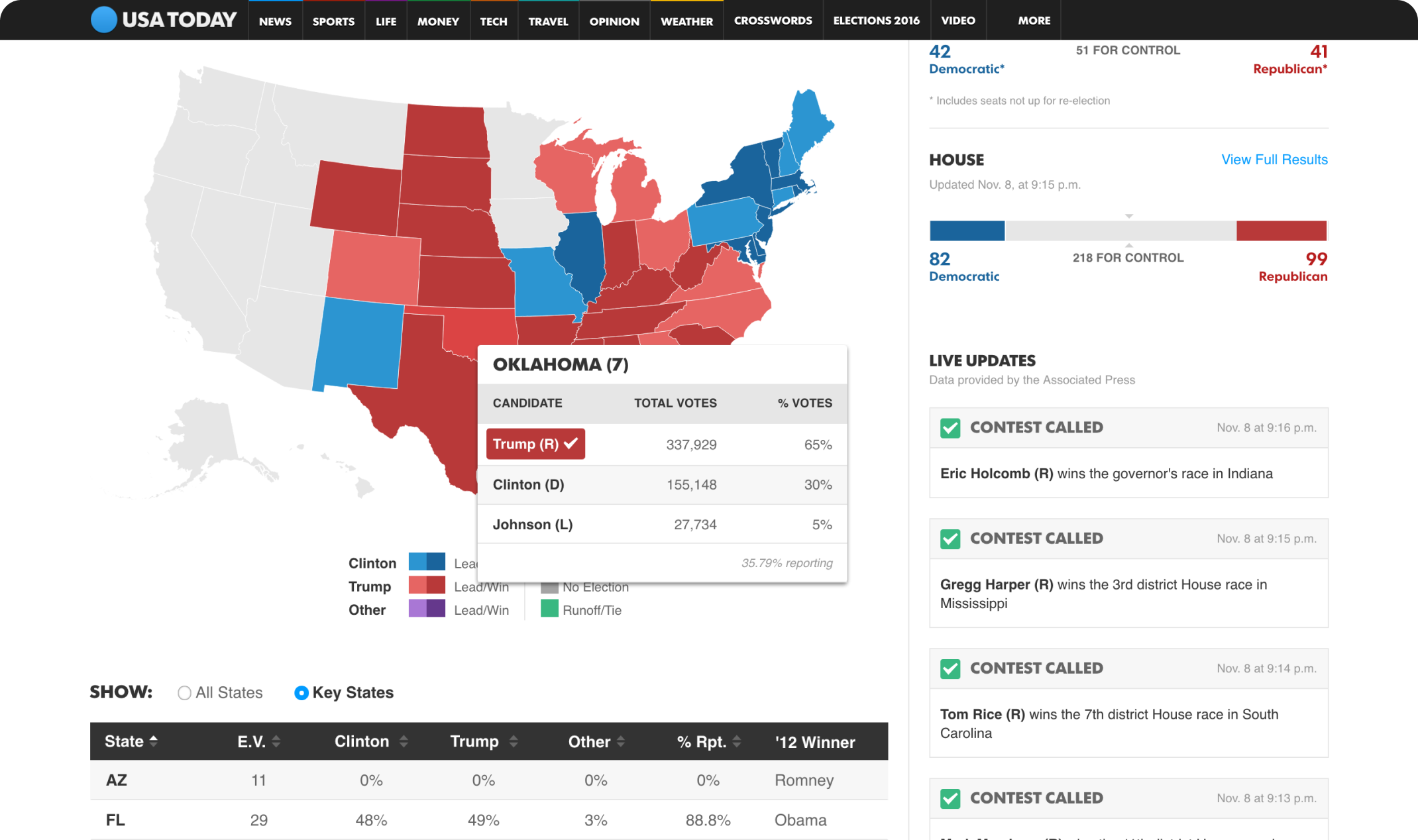
Snapshot to detailed view
We created an experience that had two levels, one for users that wanted a summary of what was happening with the election and anotherke for those who wanted a deeper dive into the details.
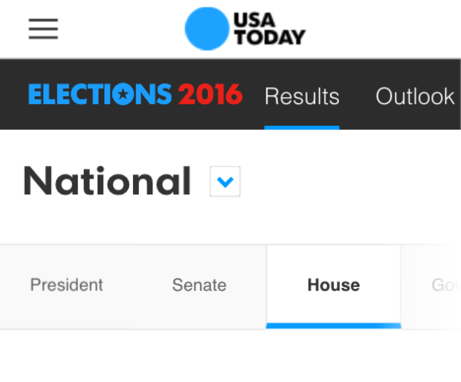
Exposed navigation
Election night happens in a blur, so the exposed navigation allowed users to get to their destination quickly and helped to increase discoverability.